The Use of Colour in Architecture
Colour as Material, Not Decoration.
As a studio, we see colour as integral to architecture rather than something applied at the end. Too often, it is treated as a cosmetic decision, a paint swatch selected late in the process. But when considered from the outset, colour can define atmosphere, shape the rhythm of a space, and enhance the relationship between inside and outside.
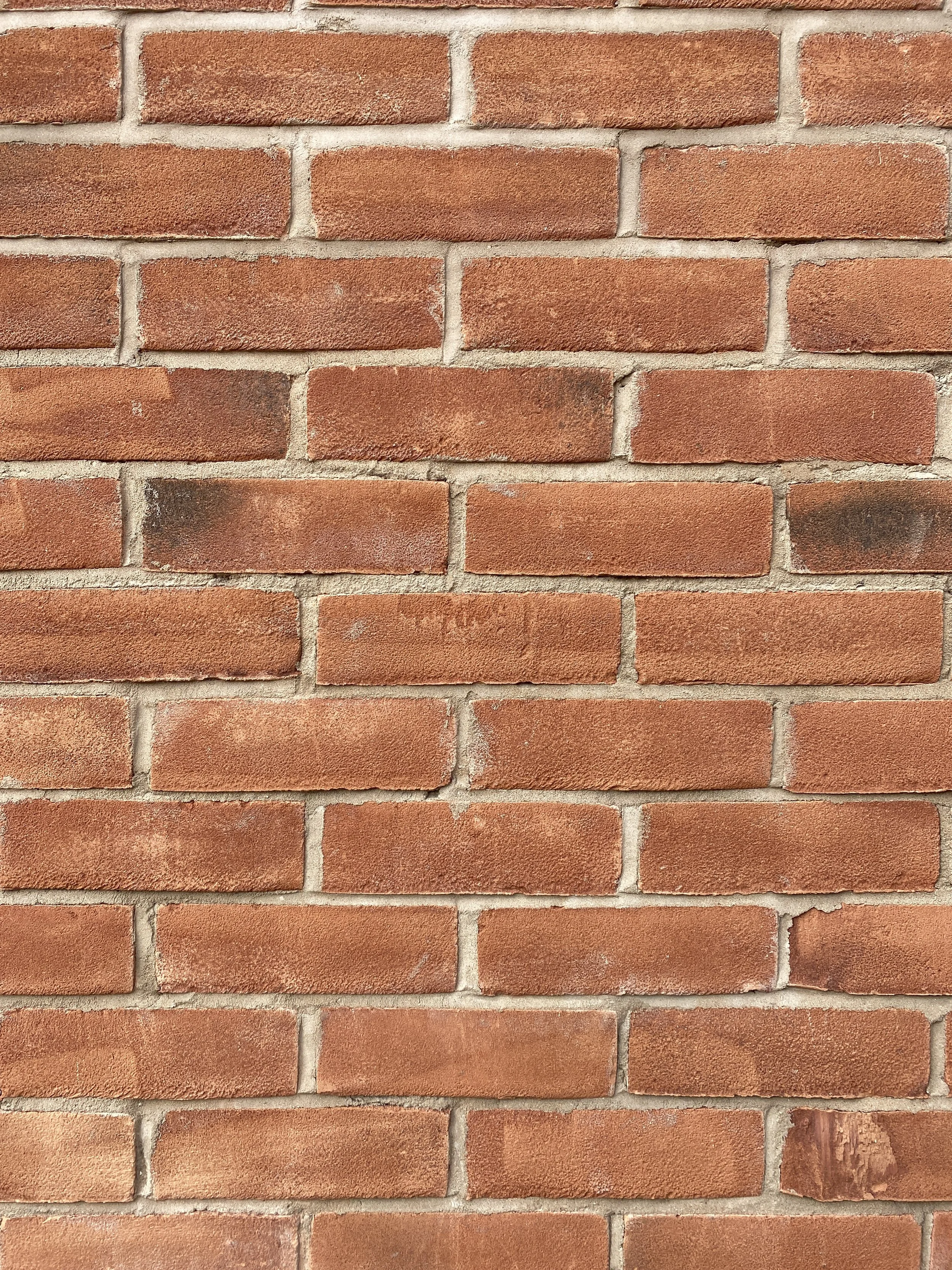
Think of the deep warmth of natural timber, the cool softness of lime plaster, or the earthy tones of bricks and clay tiles. These are not just surface treatments; they are intrinsic qualities of the materials themselves. By working with natural colours, we create buildings that are grounded, tactile and enduring.
Colour plays a vital role in translating that language into built form. It can draw attention to a building's craftsmanship or help it blend into its surroundings; it can make a familiar material feel renewed or highlight the tactile quality of natural finishes.

Colour in Context.
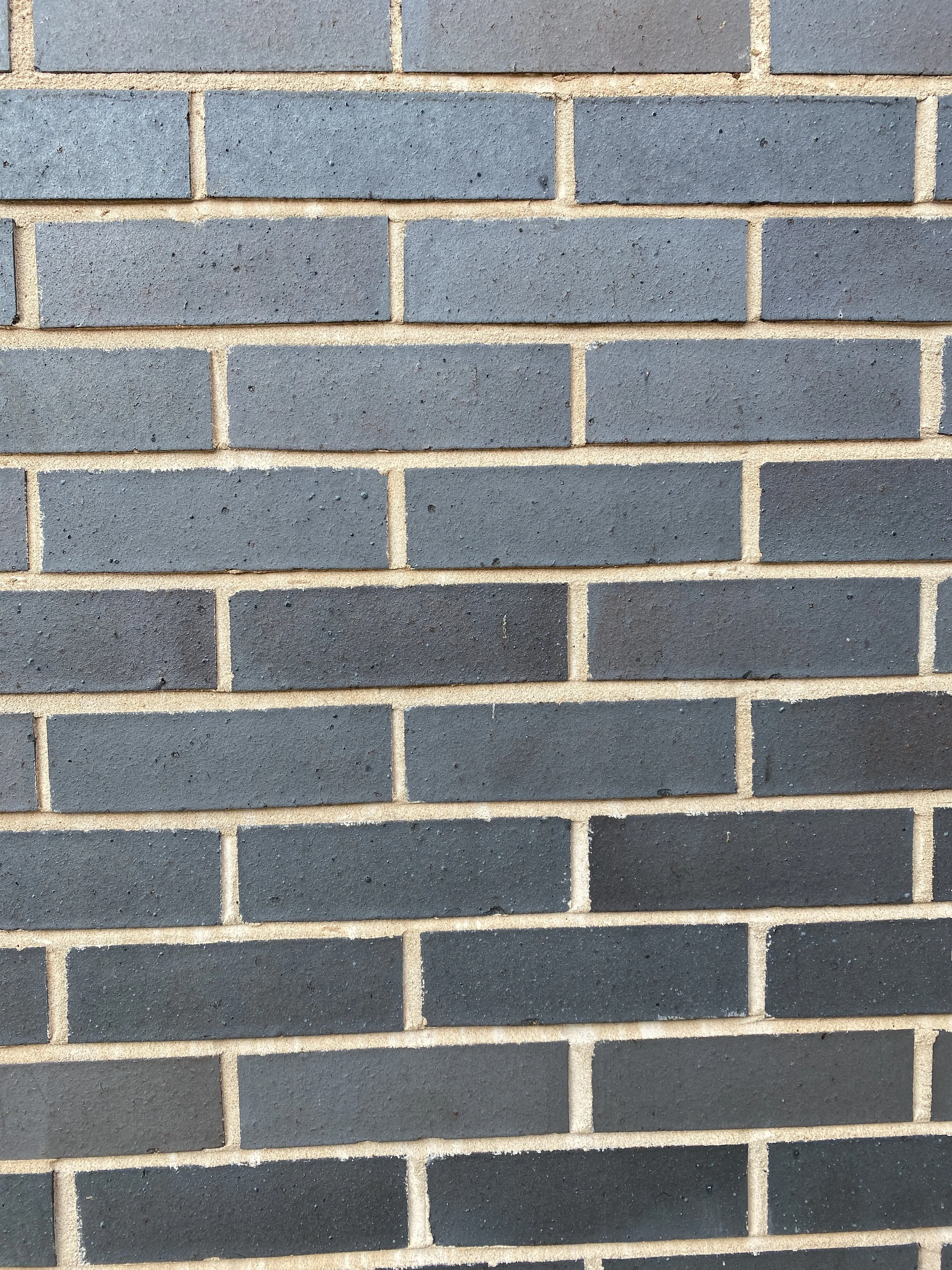
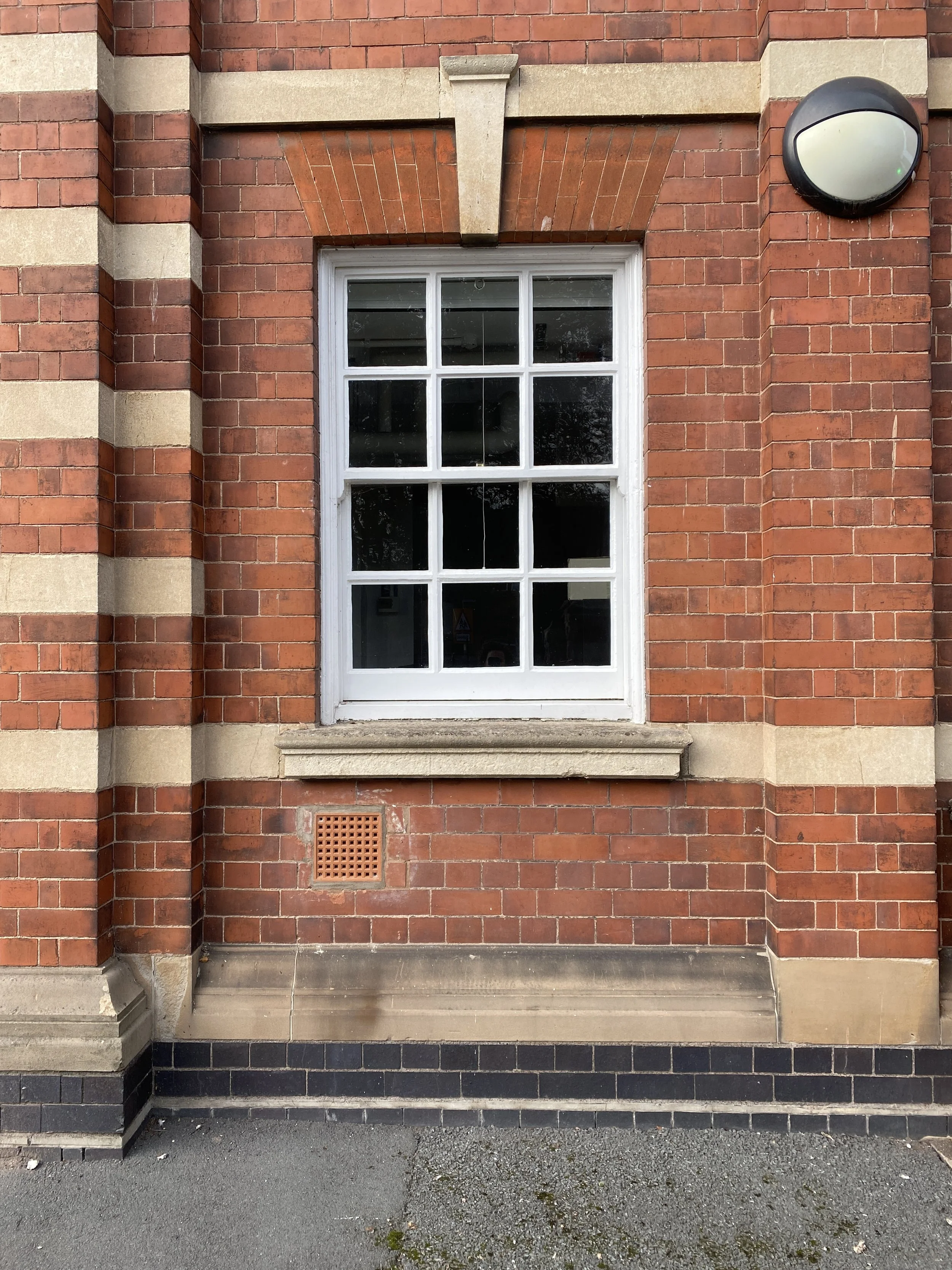
Architecture is always part of a wider setting. Colour helps buildings belong to their place. In a rural project, the muted palette of timber and stone might echo the surrounding landscape and the materials found in agricultural buildings. In denser surroundings, a specific shade of red brick can tie into a street's historic rhythm while being reinterpreted in a contemporary way. By grounding colour in context, we design buildings that feel rooted rather than imposed.
Our palette begins with what's already present: the silvers of weathered timber, the soft greens of moss and lichen, and the muted greys of stone. These tones help new buildings settle naturally into their surroundings, softening their visual impact and reinforcing a sense of continuity.
More Than an Aesthetic.
Colour does more than please the eye. It can influence mood, orientation, and perception of space. A light-filled room with pale clay walls feels expansive and calm, while a warm-toned timber-lined corner invites intimacy and reflection. In this sense, colour is not decoration, it is part of how the building works.
Colour and Cultural Significance.
Beyond landscape, colour carries stories. The red brick of a village hall. The painted door of a family farm. The weather-worn timber beam in a barn handed down generations. These are not incidental touches; they are memories. In many different environments, colour can hold cultural significance too.
It might draw from the deep reds of Victorian brickwork, the faded industrial blues of steelwork or the muted pastels of historic terraces. Through careful study of what already exists, colour becomes a means of dialogue between old and new, between collective memory and contemporary need. A well-judged palette can reinforce a building's or street's character, offering familiarity and belonging even as places change.
Colour and Performance in Harmony.
Our commitment to performance, airtightness, fabric-first design and low-carbon materials is rigorous. Yet we believe these technical standards don't preclude richness of colour; instead, they invite it. When a façade is well insulated, when daylight is controlled, when materials are chosen with care, the colour choices shine. Colour becomes part of the environmental story: it moderates glare, catches the light, or accentuates texture. A deep tone absorbs warmth; a pale tone reflects and cools. We use finishes that age gracefully, allowing patina and weathering to become part of the story. Colour here is not fast fashion; it’s slow architecture.
Colour = Identity
Each project presents a chance to ask: "How can colour enhance this space to be not just efficient, but also expressive?"
Whether it’s a rural self-build, a retrofit of a heritage building or a development in a new neighbourhood, we bring colour back into the conversation of belonging. When a building’s hues feel rooted in the local landscape and story, people live differently in it: they feel at home, connected, part of something enduring.
In an industry that too often favours speed and standardisation, the nuanced role of colour is easily lost. But when treated with care, it can become a powerful tool for creating architecture that is both beautiful and meaningful. It is through detail and craftsmanship that colour gains richness, and through colour that buildings gain character.